Pass the OAB
Context
The PasseNaOAB is an educational app focused on preparing for the OAB exam. I was responsible for the redesign of the interface, mapping user journeys, conducting user research, creating new features, and improving accessibility. In addition, I developed the landing page to promote the product.
Challenge
The original app had usability and accessibility issues, which negatively affected the user experience — especially in nighttime study contexts, common among students.
Our goal was:
Restructure the information architecture;
Improve the aesthetics of the interface without losing the visual identity;
Create clear journeys for free and paid users;
Resolve critical accessibility points;
Increase user engagement and retention.

User Research
We conducted interviews with students at different stages of studying for the OAB. The main findings were:
Poor contrast hindered reading in dark environments;
Flashcards and audio lessons were used at alternating times (day/night);
There was a willingness to pay for the premium version if the app delivered value;
Navigation was confusing and features were scattered;
Notifications and communications were seen as opportunities for emotional support and encouragement.
UX Strategy
Based on the research, we mapped the main journeys:
Free user journey: create interest and lead to premium subscription;
Subscriber journey: provide a smooth and motivating experience until approval.
We also created a future communication plan (email + push) for cold leads, leveraging seasonal events like Lawyers' Day and exam dates.
Interface and Features
Before x After
New color palette with accessible contrast;
Fixed Bottom Navigation, facilitating access to main areas;
Clear limits for free users (2 flashcards and 2 questions per day);
Notification components with multiple types of messages (promo, system, support);
Flashcards and Simulations with new organization and consistent visuals;
Audio lessons with transcription and visible teacher's name;
Correction screen with audio tips player.
Accessibility
Adoption of adequate contrasts for reading in dark environments;
Inclusion of transcriptions in audio lessons;
Improvement in visual hierarchy and focus on intuitive navigation.
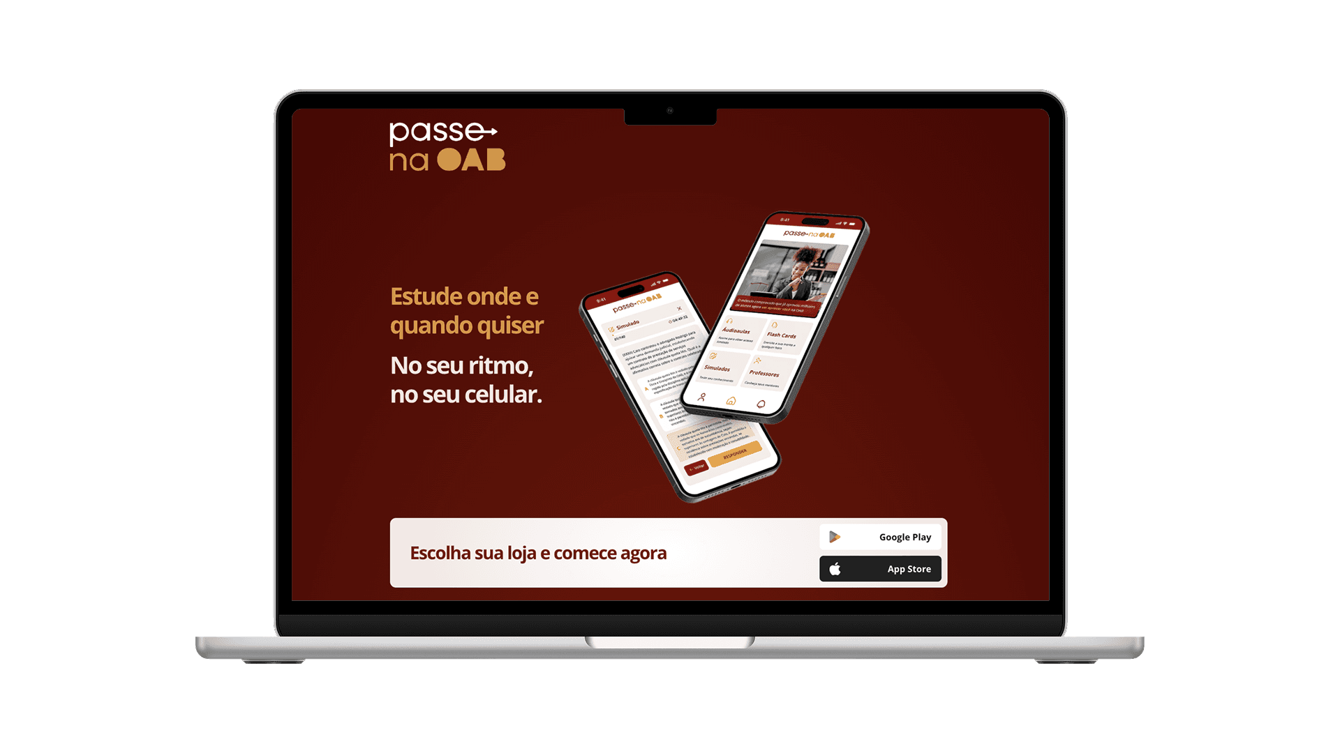
Landing Page
I was responsible for the entire creation of the landing page to promote the app, developed directly in Framer. I worked from design to implementation, taking care of all the necessary configuration to get it live.
The focus of the page was:
Present the value proposition clearly and objectively;
Highlight the app's differentials and the features of the premium version;
Encourage conversion of visitors into paying users;
Ensure performance, responsiveness, and scanability, aligned with good UX practices for acquisition.
Results and Next Steps
The improvements have been gradually implemented, with prioritization based on user feedback and the development team's resources. We have already seen a reduction in complaints related to reading and contrast, as well as a clearer organization of features — which improves the study experience in daily life.
Currently, we are planning a launch campaign to promote the new version of the app. The strategy involves:
Coordinated actions on the brand's channels (Instagram, Facebook, email, and app pushes);
Highlighting the new features and accessibility improvements;
Reinforcement of the value proposition, focusing on the positive impact on preparation for the OAB.
The expectation is to increase the number of premium subscriptions and strengthen the perceived value of the product among the target audience.